Modify the data skin information tab for a selected item
Note: Before you modify the interface for your custom data skin, you need to enable editing of the data skin interface. Information on enabling interface editing is available in Enable data skin interface editing.
Warning: Only highly skilled FH Mobile Response users should edit the FH Mobile Response interface in any way, as mistakes can cause unexpected behavior in the software, including shut-down. If you are uncertain that you have the necessary skills, contact FH technical support for assistance.
-
(If you have not done so already) Modify the search pane of the data map skin.
You should be viewing your custom data skin tab in FH Mobile Response, with any search fields you defined.
- To the right of the map, in the list of the data, select one of the data items.
-
On your custom data skin tab, choose File → Open (Read Only).
A tab with the name of the document that is being displayed appears. In a new data skin, this tab is blank, except for the Edit Form button in the middle of the tab.
Note: When you edited the
DataDef.xmlfile, you specified the tab and the name of the document on the DocumentNameFormatString line. Information on editing this file is available in Edit the DataDef.xml file for the data map skin. -
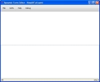
Click Edit Form.
The Dynamic Form Editor dialog box appears. As when editing the search pane for the new data skin, both the top and bottom portions of the dialog box are blank.
- Copy the following lines, and then click in the bottom portion of the dialog box and paste the lines to define the basics of the grid for the information you will display in the tab.
-
Click in the bottom portion of the dialog box, and then copy and paste the following lines.
<Gridxmlns="http://schemas.microsoft.com/winfx/2006/xaml/presentation"xmlns:x="http://schemas.microsoft.com/winfx/2006/xaml"xmlns:dsc="clr-namespace:Optimetrics.Maps.MapUIFramework.DataSkins.Controls;assembly=Optimetrics.Maps.MapUIFramework"xmlns:DocumentViewers="clr-namespace:Optimetrics.UI.WPF.DocumentViewers.Controls;assembly=Optimetrics.UI.WPF.DocumentViewers"xmlns:converters="clr-namespace:Optimetrics.UI.WPF.DynamicFormsEngine.ValueConverters;assembly=Optimetrics.UI.WPF.DynamicFormsEngine"xmlns:WinControls="clr-namespace:System.Windows.Controls;assembly=PresentationFramework"xmlns:d="http://schemas.microsoft.com/expression/blend/2008"xmlns:mc="http://schemas.openxmlformats.org/markup-compatibility/2006" mc:Ignorable="d"xmlns:player="clr-namespace:Optimetrics.UI.WPF.DynamicFormsEngine.Player;assembly=Optimetrics.UI.WPF.DynamicFormsEngine"DataContext="{Binding RootItem}"SnapsToDevicePixels="True"
> -
Copy the following lines, and then, after the lines you pasted earlier, paste the following lines into the bottom portion of the dialog box, to define grid converter resources.
<Grid.Resources><converters:CollectionCountToVisibility x:Key="CollectionCountToVisibility" /><converters:CountToVisibility x:Key="CountToVisibility"/><converters:CountToVisibility Invert="True" x:Key="CountToVisibilityInverse"/> -
(Optional) Copy the following lines, and then, after the lines you pasted earlier, paste the following lines into the bottom portion of the dialog box, to define a drop shadow effect for the information grid on the tab.
<DropShadowBitmapEffect x:Key="DropShadowBitmapEffect" Color="#000000"Direction="310" Softness="0.1" Opacity="0.05" ShadowDepth="5" />
Note: You can edit the values in
DropShadowBitmapEffectto change the color, opacity, and more, to suit your department's standards or your own personal tastes. -
Copy the following lines, and then, after the lines you pasted earlier, paste the following lines into the bottom portion of the dialog box, to define the style of the borders used on the information grid for the tab.
<Style x:Key="MainBorderStyle" TargetType="{x:Type Border}" ><Setter Property="BorderBrush" Value="#888888"/><Setter Property="BorderThickness" Value="1" /></Style><Style x:Key="ItemBorderStyle" TargetType="{x:Type Border}" ><Setter Property="BorderBrush" Value="#dddddd"/><Setter Property="BorderThickness" Value="0,0,0,1" /></Style><Style x:Key="GlassyBorder" TargetType="{x:Type Control}"><Setter Property="Template"><Setter.Value><ControlTemplate><Grid><Grid.RowDefinitions><RowDefinition Height="Auto"/><RowDefinition/></Grid.RowDefinitions><!--Background--><Border Grid.RowSpan="2" CornerRadius="4"><Border.Background><LinearGradientBrush StartPoint="0,0" EndPoint="0,1"><GradientStop Color="#000000" Offset="0.0"/><GradientStop Color="#111111" Offset="0.1"/><GradientStop Color="#181818" Offset="0.8"/><GradientStop Color="#555555" Offset="1.0"/></LinearGradientBrush></Border.Background></Border><!--top reflection--><Border CornerRadius="3" Margin="8, 2, 8, 0" Height="6"><Border.Background><LinearGradientBrush StartPoint="0,0" EndPoint="0,1"><GradientStop Color="#44ffffff" Offset="0.0"/><GradientStop Color="#11ffffff" Offset="1.0"/></LinearGradientBrush></Border.Background></Border><!--Bluish glow--><Border Grid.RowSpan="2"><Border.Background><RadialGradientBrush ><RadialGradientBrush.RelativeTransform><TransformGroup><ScaleTransform ScaleX="2" ScaleY="2"/><SkewTransform AngleX="0" AngleY="0"/><RotateTransform Angle="0"/><TranslateTransform X="-0.5" Y="-0.2"/></TransformGroup></RadialGradientBrush.RelativeTransform><GradientStop Color="#668DBDFF" Offset="0"/><GradientStop Color="#008DBDFF" Offset="1"/></RadialGradientBrush></Border.Background></Border><!--Top haze--><Border CornerRadius="4" Grid.RowSpan="2"><Border.Background><LinearGradientBrush StartPoint="0,0" EndPoint="0,0.5" Opacity=".4"><GradientStop Color="#77ffffff" Offset="0.0"/><GradientStop Color="#00ffffff" Offset="1"/><GradientStop Color="#00ffffff" Offset="1"/></LinearGradientBrush></Border.Background></Border><!--Outline--><Border Grid.RowSpan="2" CornerRadius="4" BorderBrush="Black"BorderThickness="1"></Border></Grid></ControlTemplate></Setter.Value></Setter></Style></Grid.Resources>Note: You can edit the values in the lines above to change the appearance of the borders, to suit your department's standards or your own personal tastes.
-
Copy the following lines, and then, after the lines you pasted earlier, paste the following lines into the bottom portion of the dialog box, to define the beginning and ending of the border and scrolling area for the information tab in the data skin.
<Border Grid.Column="1" Style="{StaticResource MainBorderStyle}"Background="WhiteSmoke" Margin="8" ><ScrollViewer><StackPanel Margin="12">
</StackPanel></ScrollViewer></Border>Note: You can edit the values in the lines above to change the appearance of the borders, to suit your department's standards or your own personal tastes.
-
Between
<StackPanel>and</StackPanel>, type XAML coding into the bottom portion of the dialog box, to define how you want to lay out the grid of data on the information tab.Note: You can lay out the data according to your department's standards or you own personal tastes. The XAML code used between
<StackPanel>and</StackPanel>will vary accordingly.Examples of XAML code and the resulting lay outs on the information tab of a data skin are available in Examples: XAML code and the resulting layouts on a tab.
-
Choose File → Save and Exit.
The data in the item's document appears on the data skin information tab with the name of the document in FH Mobile Response, and a
ViewUIFull.xamlis automatically created in your custom map data skin folder. - Continue with Disable data skin interface editing.
